, 62 tweets, 20 min read
Anyone else doing some weekend reading of the #Gutenberg #accessibility audit report?

wpcampus.org/2019/05/gutenb…

#WordPress #a11y A screenshot of the cover page for the Gutenberg Accessibility Audit Report. Gutenberg is the new WordPress editor.
I’m going through and taking notes. The report is fascinating.

Seriously taken aback at page 5 of the UX report.
Time for the last document, and main event: the 329 page long-form technical report describing the logged issues in detail.
On pages 4-5 of the long form #Gutenberg #Accessibility audit report, kudos to @TenonAPI for advocating against disregarding issues listed as "low" severity and how WCAG levels (A, AA, AAA) should not be used as an indicator of importance or priority. Any issue is a issue, y’all.
Page 45 in the report is a great learning experience for anyone building websites:

”The table which results is only a series of rows and columns with no column‐header information, which may cause assistive technologies to assume these are layout tables rather than data tables.”
Page 56 is a common #accessibility problem where devs use <a> incorrectly instead of <button>.

This is not semantic. “#” is not a valid URL. The choice of button vs. link has a significant effect on expectations for assistive technology users. <a> = navigate to a different page.
Page 84 is a great example of common issues surround dialog windows and modal popups.

You must let users know they’ve entered or left the dialog/popup. You must watch out for/remove keyboard trap.

There’s a lot of details and info on this page. I highly recommend reading.
Page 89 is a great example of how you must communicate changes in state.

For example, when a user clicks the “Undo” or “Redo” button, this change in state is not accounted to screen readers. You can only “see” what’s changed visually.

Implement aria-live to announce the change.
Had to get more supplies to be at my best for continued reading. A view looking down at my table, where I have my iPad open to the report I’m reading surround by a bag of pita chips and hummus and a gin cocktail.
Even I’m learning something new! I love this report.

Page 99 says “Some combinations of browser and assistive technologies do not reliably support implicit association.” In other words, you can’t just wrap the <label> around an <input>. Use “for” and “id” attributes.
There’s a whole section in this report on forms and it’s highly valuable reading.

If you use a #WordPress form plugin: advocate/ask your developer to read.

If you build a form plugin: this is free #accessibility development.

@gravityforms @calderaforms @ninjaforms Anyone else?
If you really want to garner some empathy, read pages 145-148.

Just reading this issue is overwhelming. I’ve tested this issue and the heading “Keyboard operation is confusing and inconsistent” is an understatement.

This will be a lot of work, but super valuable.
There’s a lot of great examples in here on how to properly use <dl> <dt> and <dd> elements. Page 154, for example. Also page 67.
Pro tip: always organize your content in the order it should/would be read. If you want the layout to look different, change visually with CSS.

Same goes for grammar. If you want text to visually be all caps, write the content using proper grammar. Caps with CSS.

#accessibility
Basically, one way to help your site be accessible is to structure your content as if CSS doesn’t exist. A lot of users don’t navigate your site visually. Using this line of thinking will help a lot with #accessibility.
A lot of this report is highlighting what most #a11y advocates preach: the majority of #accessibility problems are the result of devs using invalid/not semantic markup. Whether it’s not using HTML spec correctly or it’s removing default styles. These settings exist for a reason.
Wow page 164. Moving on...
lol page 175...
But, seriously, page 175 is why we follow semantic markup and don’t change browser style defaults! There’s a reason these settings exist. Changing the way a default browser style looks for you could entirely break a UX for other users who depend on those settings.
Alright. I made it into the 200s. I’m gonna call it a night. I’ll pick this back up tomorrow. Goodnight!
Good morning all! Coffee is brewing and breakfast has been made. It sounds like the perfect time to dive back into the report.

I’m picking back up on page 202.

Common issues we’ve seen so far:
- Missing/invalid markup
- Low contrast
- Keyboard focus
- State change management
Page 202 is a great example of something to look out for with forms and focus and state management issues.

Basically, there are radio buttons which, if selected, open dialog windows and potentially lose user focus and change the context of the page.

Definitely worth a read.
A common #accessibility issue: “when X is clicked, focus is reset to the top of the page.”

If a screen reader clicks a button, and you use JS to manipulate the DOM as a result, you have to ensure focus is returned to that spot.

imagine having to traverse the DOM all over again.
FYI: my last tweet was motivated by page 204, but there’s been a few related examples.
I learned something new on page 207: SVG elements are focusable in IE11 because of an anomaly in IE.

For this instance, the report recommends “Add focusable=“false" and aria‐hidden=“true” so they're not focusable nor announced by assistive technologies.”

#accessibility
Page 211 is quite interesting, and an area where I don’t have much experience: role=toolbar

It talks about how toolbars should allow for assistive technologies to skip past them (and therefore skip lots of tabbing). Also addresses tab vs arrow key navigation.

A must read!
Page 215 is a complex example of a common issue: inconsistent keyboard focus/navigation.

Don’t trap focus within elements, e.g. popups you can’t close or leave.

Also, sighted keyboard users shouldn’t be able to navigate outside a popup while its still open.

#accessibility
Page 218 is an example of a small (easy) change that makes a big impact on #accessibility:

“Whenever the current page is reflected in a menu on that page, add `aria‐current="page"` to the applicable link.”

Example: <a href="..." aria‐current="page">...</a>

#a11y
Page 223 highlights a common issue: you don’t always need aria labels!

Especially if the aria-label matches the label provided by the element.

Purpose of aria-label is to provide missing context e.g. aria-label says “Learn how to make coffee” when your button says “Learn more”.
As the report points out, redundant labels do not necessarily have a bad affect on end‐users, but unnecessary `aria‐label` attributes create the possibility of mismatches between visible labels and accessible names when content is updated.

#accessibility
Page 227 recommends encouraging against auto play videos.

I say we don’t allow it at all. Who ever liked this UX?

“Autoplaying video can interfere with users of text‐to‐speech software... as well as make focussing on content difficult for users with cognitive disabilities.”
Page 228 introduces an issue related to speech recognition software, such as Dragon NaturallySpeaking.

It seems it’s difficult to bring focus into blocks and edit the title of the post.

Well worth a read.

#accessibility
I’ve reached page 231 of 329. Less than 100 pages to go!
Page 233 is an intriguing example of complex, inaccessible functionality: cropping images. You can only crop images if you can use a mouse. It also seems quite troublesome to navigate between the form elements.

This task will be interesting to follow.
Has anyone ever come across an accessible tool for cropping images in a web browser?

#accessibility
Page 237 is another example of behavior that causes inaccessibility and confusion by changing default browser styles.

This instance: changing the default cursor.

These default browser styles exist for a reason and encourage consistent (and intuitive) behavior.

#accessibility
An #accessibility lesson I’d like to highlight after reading page 241:

Always provide an Escape key handler to close any popups, modals, dialogs, tooltips, or other overlays you add/initiate on a page.
Currently on page 246.

There seem to be a lot of issues when zoomed in.

Users can’t access, or even visualize, controls. The “sticky” bar covers or blocks other components.

This will be an interesting issue to remediate.
The zoom issues continue on page 250: “Buttons vanish at larger zoom levels and on mobile”

Basically, users who depend on zoom are triggering mobile styles which seem to hide a lot of functionality, including many of the buttons in the Editor Top Bar.
“There doesn't appear to be another method of performing the Undo, Redo, Content Structure or Block Navigation functions when the mobile view is triggered. Users with keyboards may never see the shortcuts for using these controls, while touchscreen users cannot use them at all.”
Alright. Time for a food break. I even made my own iced coffee! #mmm A glance at my dining table. In the foreground, a glass mug filled with delicious iced coffee. The glass is from Ithaca beer co. Definitely not my glass. Beer is gross.
Alright. I had a tasty salad and watched an episode of @veronicamars. @woodwardjd and I are re-watching my favorite show before the new season airs this summer. I’m a big marshmallow.

Back to reading the report. I’m on page 257.
Page 257-258 highlight some interesting, not often discussed issues related to setting the language and text direction of content.

Basically, you should be able to set this information on a block and page level. Not just at the site level.

Fascinating.

#accessibility
Page 259 is related to issues we’ve seen regarding users zooming in but slightly different: issues users face when they simply enlarge their text.

“Users who need to increase the text size will find that some block content overlaps its containers, and other content.”
How do you remediate this issue?

“Set minimum sizes using `min‐width` and `min‐height`, rather than fixed sizes using `width` and `height`, to allow containers to expand with increases in their content size.

Set SVG sizes in units that will scale with text.”

#accessibility
There’s another example of this behavior on page 265.

It seems a lot of elements on the “Edit Media” screen are clipped when text spacing or size is enlarged.

There are some great screenshots in the report. I highly recommend you check it out.
Strangely enough, there’s even an issue where screen reader users have info that sighted users do not.

Page 270 points out a close button is invisible to most users, although it does have visually‐hidden text for screen reader users.

#accessibility means access for everyone.
The trend continues on page 272.

I very much appreciate this report pointing out where “Useful content is unnecessarily hidden”.

Basically, there seems to be a trend where helpful instructions are provided to screen reader users but hidden to everyone else.
“Where users can add tags to their document, hidden text states these can be comma‐separated. This text is only available to screen reader users, even though these instructions are useful to many sighted users, such as those with a cognitive disability and keyboard‐only users.”
The takeaway on pages 270-274 is a small but extremely valuable lesson regarding the importance of information over design.
Pages 275-285 address more issues related to content overflow and clipping text when users zoom in to enlarge the screen.

This instance: the Block and Document panel.

The report provides a lot of guided remediation.

Takeaway: don’t set fixed height (or sometimes width).
Page 286 is another example of the importance to use HTML as intended, in function and design.

The issue: there is a button that is made to look like a link.

There’s a reason we underline links by default: it sets user expectations. Links and buttons have a different purpose.
If you remember from earlier in the thread, <a> elements are meant to navigate to a different page. Use a <button> to initiate action on the current page.

If a user sees underlined text, they expect to go to a different page.

Understand the problem?

#accessibility
Oh wow. Page 290 is the last issue.

Unsurprisingly, it’s another one involving content overflow and clipping.

Heads up: users will increase font size and zoom in to enlarge the screen. Ensure your containers do not have set dimensions that will clip your content.
Page 290-392 contain the appendices.

They allow you to navigate the issues by:

- Severity
- Content category
- Component
- Affected population
- WCAG Success Criteria

Wow. I’m done!
I typed up this whole tweet with a bunch of interesting facts from the report, but I don’t want them to be shared out of context.

If you really want to know, I highly recommend reading the report. It was fascinating.
If you’d like to help remediate these issues, I recommend joining the #WordPress design, core, core-editor, and, of course, the accessibility team. They are all working on remediation plans and I’m sure they’d love your help.

make.wordpress.org
I’d also highly recommend sharing this report with other front-end devs. No matter if you use #WordPress or another platform, this report is full of valuable education to help you build accessible single page apps and other web interfaces and technologies. #accessibility
If you’d like to give back to @wpcampusorg for commissioning this report, we’re looking for speakers for our annual conference! We focus on #HigherEd, #accessibiliy, #WordPress, and other #EdTech.

But hurry! The deadline is today!

2019.wpcampus.org/call-for-speak…
Alright, y’all. It’s been a lot of fun. Now I get to take all this knowledge and finish my own accessibility audit for a client.

I have a few interviews lined up this week regarding the report. I’ll let you know when they’re published.

Thanks for following along!
Also, this thread is a nice high level summary but I highly encourage you to find the time, and encourage others, to read the report. It’s overflowing with quality education on how to build accessible single page apps and other web interfaces and technologies.

#accessibility
FYI: if you have questions about the #Gutenberg #accessibility audit or want to learn more: #WordPress
Missing some Tweet in this thread? You can try to force a refresh.

Enjoying this thread?

Keep Current with Rachel Cherry

Profile picture

Stay in touch and get notified when new unrolls are available from this author!

Read all threads

This Thread may be Removed Anytime!

Twitter may remove this content at anytime, convert it as a PDF, save and print for later use!

Try unrolling a thread yourself!

how to unroll video

1) Follow Thread Reader App on Twitter so you can easily mention us!

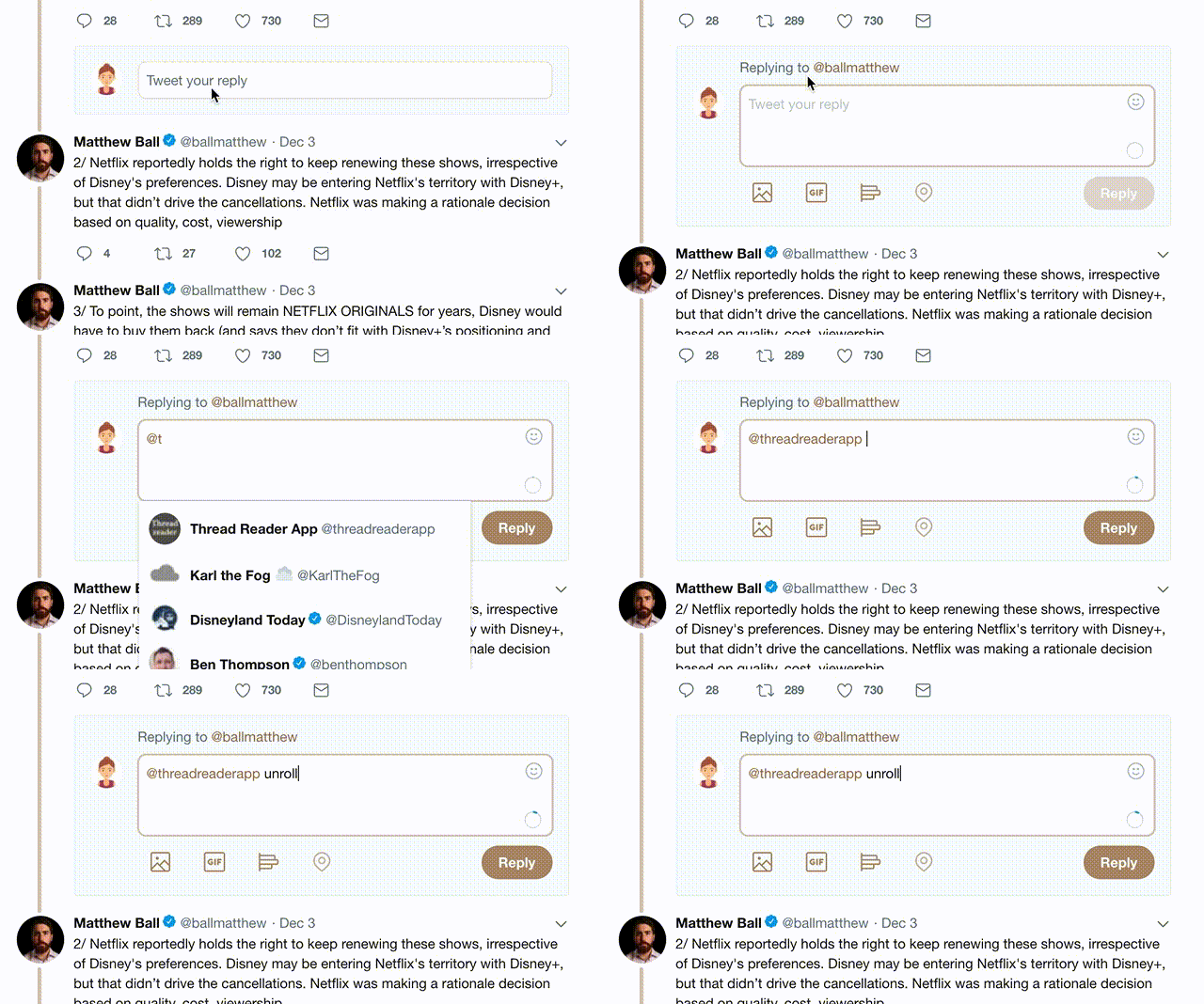
2) Go to a Twitter thread (series of Tweets by the same owner) and mention us with a keyword "unroll" @threadreaderapp unroll

You can practice here first or read more on our help page!

Follow Us on Twitter!

Did Thread Reader help you today?

Support us! We are indie developers!


This site is made by just three indie developers on a laptop doing marketing, support and development! Read more about the story.

Become a Premium Member ($3.00/month or $30.00/year) and get exclusive features!

Become Premium

Too expensive? Make a small donation by buying us coffee ($5) or help with server cost ($10)

Donate via Paypal Become our Patreon

Thank you for your support!