Discover and read the best of Twitter Threads about #BigCityGreens
Most recents (24)


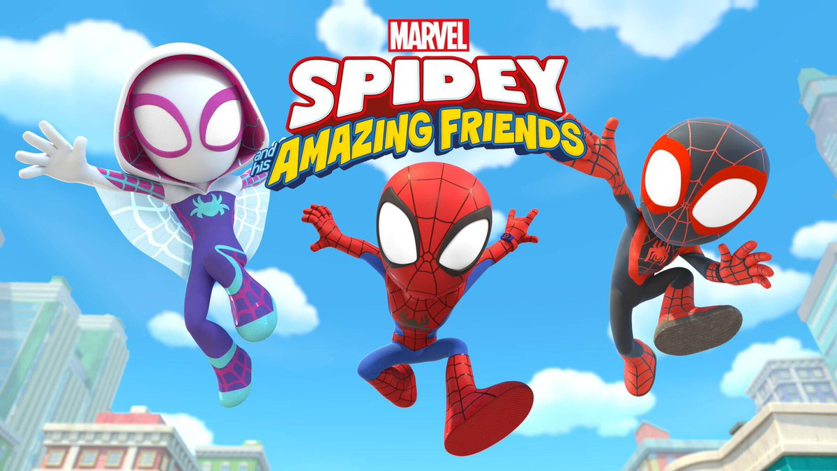
8:30am - #SpideyAndHisAmazingFriends
“Sand Trapped/Too Much Fun”
Sand Trapped - Team Spidey gets trapped in Sandman's giant sand maze
Too Much Fun - The Spidey Team swings into action to bring back the fun after Electro supercharges the amusement park.
“Sand Trapped/Too Much Fun”
Sand Trapped - Team Spidey gets trapped in Sandman's giant sand maze
Too Much Fun - The Spidey Team swings into action to bring back the fun after Electro supercharges the amusement park.
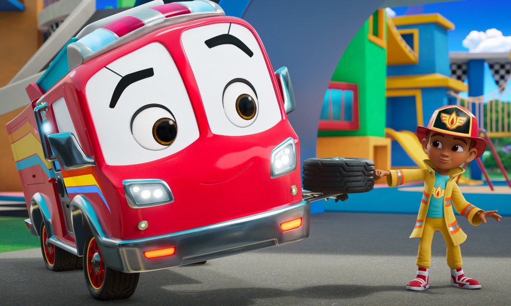
10:30am - #Firebuds
“Marsh Mayhem/The Art of Friendship”
Marsh Mayhem - Kid reporter June gets famous at school after reporting a sighting of an urban legend
The Art Of Friendship - The Firebuds create a giant mobile to cheer up kids in the hospital.”
“Marsh Mayhem/The Art of Friendship”
Marsh Mayhem - Kid reporter June gets famous at school after reporting a sighting of an urban legend
The Art Of Friendship - The Firebuds create a giant mobile to cheer up kids in the hospital.”

Let's discuss pushing the boundaries of distortion and style for cinematic and emotional impact.
An environment design thread:
An environment design thread:

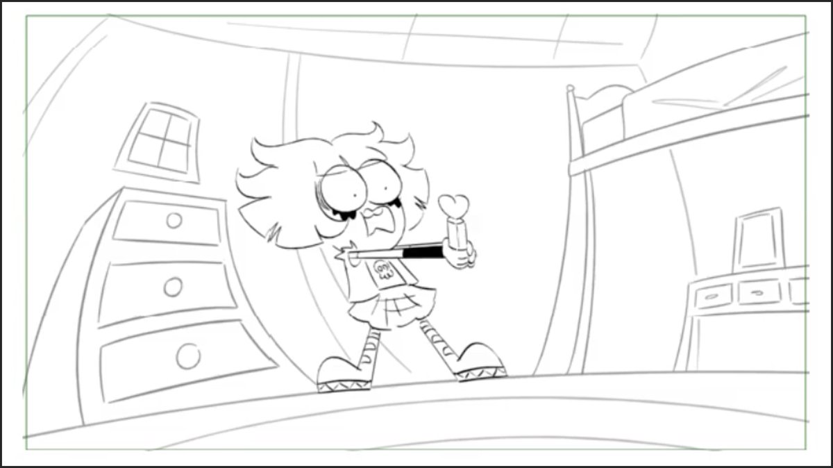
Spoiler alert. We have this #BigCityGreens episode called Big Trouble where Tilly "goes bad" and wrestles with her internal demons.
That emotional conflict is what this thread is about.
That emotional conflict is what this thread is about.
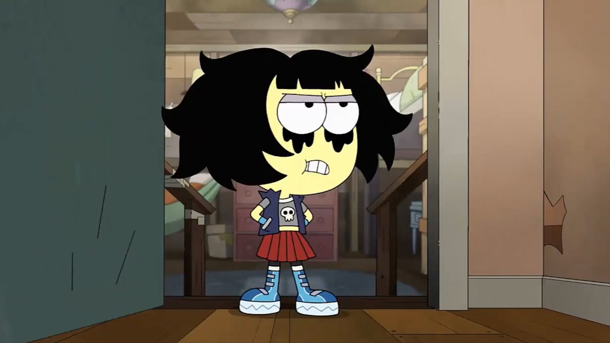
There's this shot in the storyboard (by @Hug_bees) where Tilly faces her guilt over some bad decisions.
The background is drawn in a distorted manner to reflect the turbulent emotional struggle within her.
How do I push that feeling in the final background design?
The background is drawn in a distorted manner to reflect the turbulent emotional struggle within her.
How do I push that feeling in the final background design?
Let's combine 2 drawing tricks I recently covered:
- Drawing half a scene for symmetrical design.
- Applying dynamic perspective in Photoshop.
Another step-by-step thread:
- Drawing half a scene for symmetrical design.
- Applying dynamic perspective in Photoshop.
Another step-by-step thread:
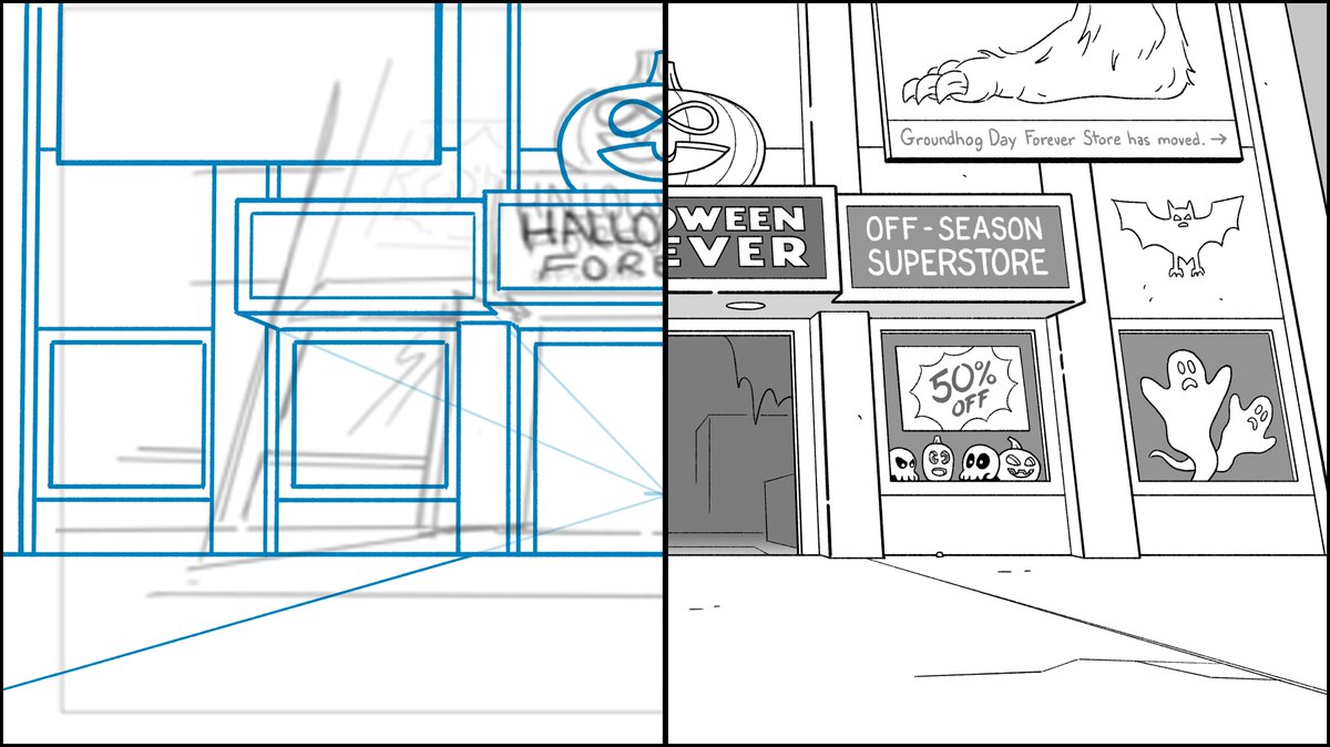
Since it's October, I chose this shot of a Halloween superstore from #BigCityGreens.
I drew a vertical line through the exact center of the canvas as a guide.
Placing my vanishing point low in the scene will create the perspective of looking upward.
I drew a vertical line through the exact center of the canvas as a guide.
Placing my vanishing point low in the scene will create the perspective of looking upward.

Because this is a symmetrical scene, I only needed to draw half the rough up to my vertical centerline.
This is my first trick.
Even the pumpkin with its clever infinity symbol eyes are symmetrical.
This is my first trick.
Even the pumpkin with its clever infinity symbol eyes are symmetrical.

How to draw natural symmetrical architecture.
Yes, it's as simple as you think.
A step-by-step thread:
Yes, it's as simple as you think.
A step-by-step thread:

Start with your rough.
In this case, it's a storyboard panel from #BigCityGreens episode, Quiet Please.
The point is to quickly lay out your symmetrical composition.
In this case, it's a storyboard panel from #BigCityGreens episode, Quiet Please.
The point is to quickly lay out your symmetrical composition.

Draw a vertical line directly in the center of the canvas and place your vanishing point upon it.
A vanishing point dead center vertical AND horizontal is pretty unnatural so I lowered it a little. Feels better.
A vanishing point dead center vertical AND horizontal is pretty unnatural so I lowered it a little. Feels better.

DVD rack in the library on #BigCityGreens.
I pulled all these spoof titles from past episodes but drew all the covers.
Closeups in the thread:
I pulled all these spoof titles from past episodes but drew all the covers.
Closeups in the thread:

The Affiliates = The Avengers
America Rat = Captain America
Henry Cauldron = Harry Potter
I put a lot of care into the Henry Cauldron typestyle.
America Rat = Captain America
Henry Cauldron = Harry Potter
I put a lot of care into the Henry Cauldron typestyle.

It's Mama Time = Big Mama's House
Constellation Battles = Star Wars
Croblins = Trolls
The Constellation Battles character and ship designs I pulled from an older episode and arranged into a cover design.
Constellation Battles = Star Wars
Croblins = Trolls
The Constellation Battles character and ship designs I pulled from an older episode and arranged into a cover design.

More tips about using perspective to reimagine the impact of a scene in animation environment design.
A step-by-step thread:
A step-by-step thread:

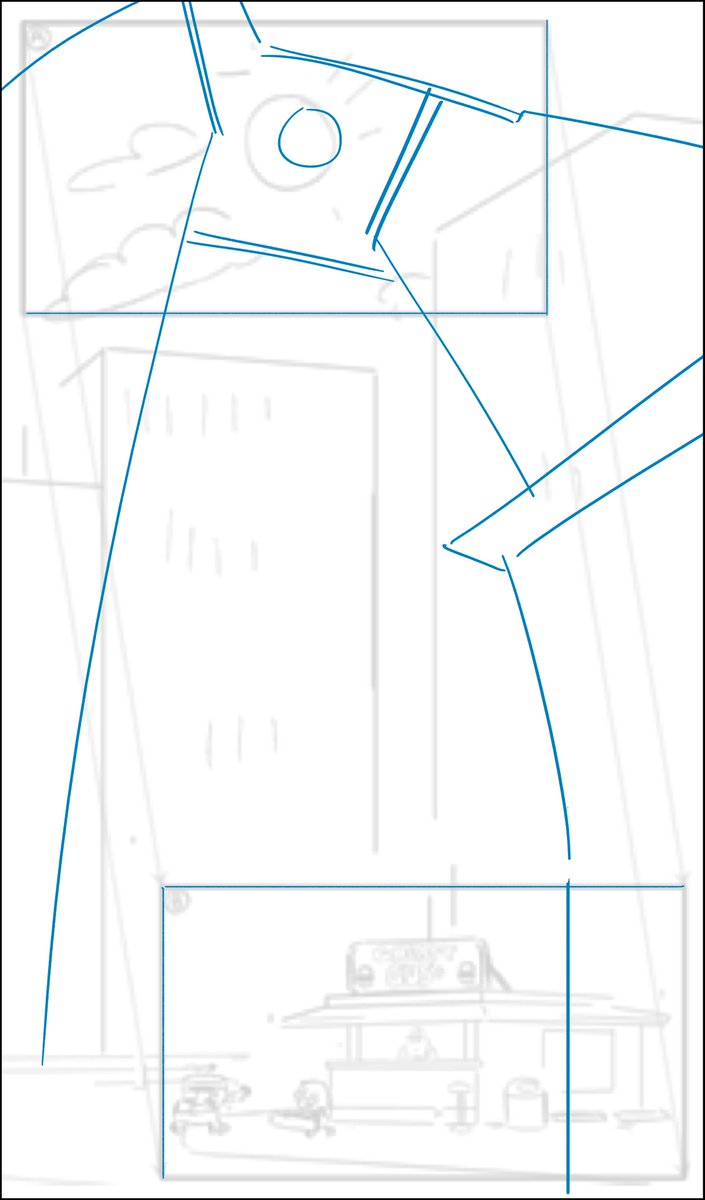
(Twitter aggressively crops these tall pans so click on them to see all.)
First, the story of this storyboard panel is we start on a midday sun and pan down to a little burger shack surrounded by skyscrapers.
Always ask yourself how you can tell the story better with design.
First, the story of this storyboard panel is we start on a midday sun and pan down to a little burger shack surrounded by skyscrapers.
Always ask yourself how you can tell the story better with design.
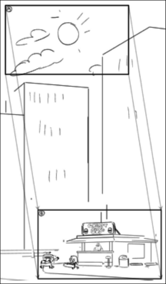
I looked to the start of the pan to help tell the story of the shack surrounded by architecture. I wrapped our view of the sun in buildings.
This establishes the feeling of the location earlier than later in the pan.
In this quick concept, I redesigned the composition.
This establishes the feeling of the location earlier than later in the pan.
In this quick concept, I redesigned the composition.
My son watching #BigCityGreens on #DisneyPlus.
“Daddy, did you draw that background?”
“No.”
“That one?”
“No.”
“How about that one?”
“Yes.”
“Daddy, did you draw that background?”
“No.”
“That one?”
“No.”
“How about that one?”
“Yes.”

To be fair, the background seen here was not designed by me, but by season one BG designer, Dylan Foreman. #creditwherecreditisdue
I just couldn’t snap a good photo of one of mine.
I just couldn’t snap a good photo of one of mine.
Also, I’m digging our new TV stand.
How to use a camera movement to reimagine a scene in animation background design.
A step-by-step thread:
A step-by-step thread:


What the storyboard intended was to move the camera from the top of a skyscraper to street level with a short diagonal pan.
But the scale of the buildings doesn't work well in the storyboard.
To fix this...
But the scale of the buildings doesn't work well in the storyboard.
To fix this...

I reframed the pan with more vertical height in order to give me enough space to design.
But I didn't add so much as to drastically alter the timing. I let the timing director know.
But I didn't add so much as to drastically alter the timing. I let the timing director know.

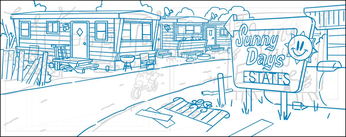
Let's look closely at another trailer park background from #BigCityGreens designed by me, painted by @spookybri.
A process thread:
A process thread:

Again, starting with the storyboard.
This panel is about staging the action for the characters and giving a basic composition.
This panel is about staging the action for the characters and giving a basic composition.

I threw down a grid to lay out the perspective.
This is a quick way to find perspective without dealing in vanishing points that would be so far away.
This is a quick way to find perspective without dealing in vanishing points that would be so far away.

How to give story to a location through details.
Let's look closer at this background from #BigCityGreens.
A thread:
Let's look closer at this background from #BigCityGreens.
A thread:
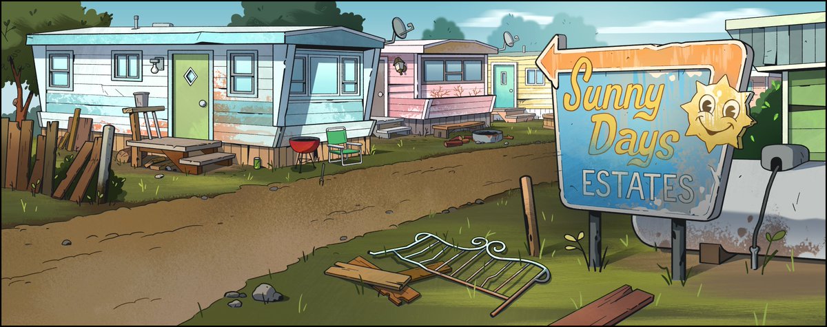
As a base, let's look at the storyboard. What are the broad story strokes?
Trailer park.
Rural.
Tight quarters.
Weathered and worn.
Littered.
Ironic name.
Trailer park.
Rural.
Tight quarters.
Weathered and worn.
Littered.
Ironic name.
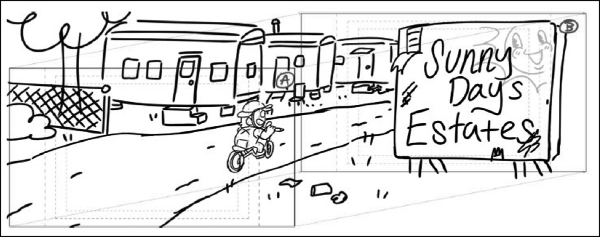
I built the location with those things in mind, never veering from them and only enhancing them.
This is the rough I drew over the storyboard.
This is the rough I drew over the storyboard.
A bale of backgrounds for #BigCityGreens episode, Friend Con, which takes place at Farm Con.
I designed these but they were colored by our talented background paint department.
I designed these but they were colored by our talented background paint department.


This isn’t the most exciting of locations to design but it did provide for some good humor.
100% DIRT.
100% DIRT.
I get a lot of satisfaction out of drawing cylindrical hay bales.
On the title card I designed for #BigCityGreens episode Greens' Acres, I took typestyle inspiration from the classic 1960s sitcom, Green Acres.
I slapped it on a tomato instead of a barn roof.
#televisionlegacy
I slapped it on a tomato instead of a barn roof.
#televisionlegacy


The dew drops really became a nice touch when it got painted.
Two songs came to mind when drawing this.
- The theme song from Green Acres.
- Hang on Little Tomato by Pink Martini.
- The theme song from Green Acres.
- Hang on Little Tomato by Pink Martini.
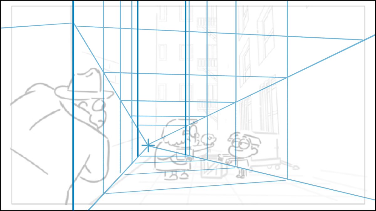
I've designed so many grungy alleys in #BigCityGreens, it was time for something different.
Research brought me to this electrical mess strewn between buildings. I kept it up and out of the way of the ground level action of the characters.
How'd I draw this? A breakdown thread:
Research brought me to this electrical mess strewn between buildings. I kept it up and out of the way of the ground level action of the characters.
How'd I draw this? A breakdown thread:
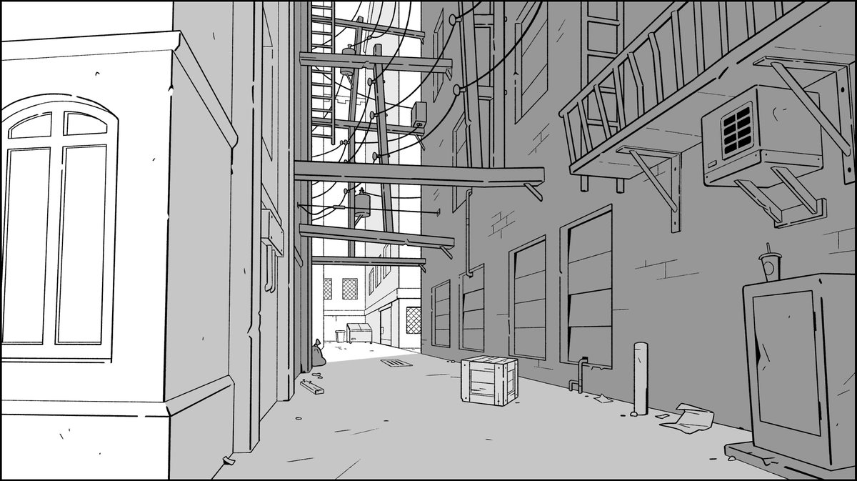
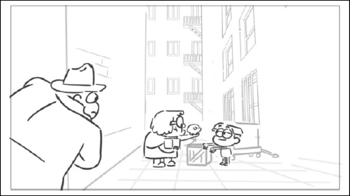
First, here's the storyboard panel which reused part of a different alley I had once drawn.
Since this is the location of the climax of the episode, I felt the alley needed more visual tension to support the story.
Since this is the location of the climax of the episode, I felt the alley needed more visual tension to support the story.
Let's get technical: perspective.
I chose a vanishing point near where the shady guy is looking.
By shifting the vanishing point to the left of center, we feel like the camera is more with that character.
Then I built the structure of the alley from there.
I chose a vanishing point near where the shady guy is looking.
By shifting the vanishing point to the left of center, we feel like the camera is more with that character.
Then I built the structure of the alley from there.
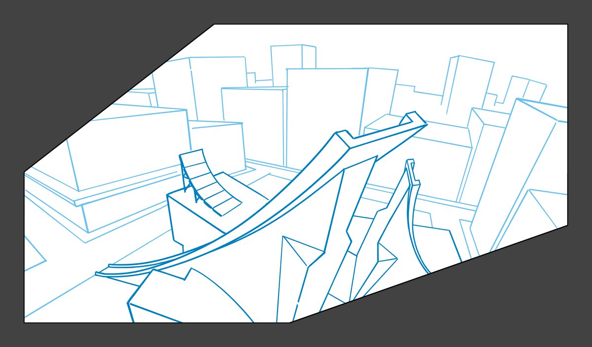
Let's look at another angle of the "Ramp Museum" and break down the process.
#BigCityGreens
A lil thread:
#BigCityGreens
A lil thread:

Let's start with the storyboard which gave me very little to work from, but I understood the path the car needed to make.
That's the important action of which I designed around.
That's the important action of which I designed around.

My goal was to give the scene an epic sense of depth and make sure it was clear the car was jumping into the sky.
That required a distorted perspective that started with a downshot on the street and ended above the rooftops.
All centered around a cubist modern building.
That required a distorted perspective that started with a downshot on the street and ended above the rooftops.
All centered around a cubist modern building.

This is actually a temporary setup on my son's activity table. My new desk arrives next week.
I have a thing for Victorian style lighting. I’ve had that lamp for over two decades.
Animation Fact:
Most American television animation is animated in other countries.
Writing, design, storyboarding, color, editing, etc. are all done at US studios.
But the actual finished animation gets produced and compiled overseas.
An informative little thread:
Most American television animation is animated in other countries.
Writing, design, storyboarding, color, editing, etc. are all done at US studios.
But the actual finished animation gets produced and compiled overseas.
An informative little thread:
Simply put, all the creative prep work for a show is produced in the US, then "shipped" via the internet.
(Before the digital age, art on paper was shipped in boxes across the ocean.)
The studios then make a show based on the storyboard, designs, recordings, and timing.
(Before the digital age, art on paper was shipped in boxes across the ocean.)
The studios then make a show based on the storyboard, designs, recordings, and timing.
Examples:
We provide character designs. Based on the actions in the storyboard, the animation artists make them move fluidly on model.
We design every location but not every background that takes place in a location. The studio fills in the missing scenes.
We provide character designs. Based on the actions in the storyboard, the animation artists make them move fluidly on model.
We design every location but not every background that takes place in a location. The studio fills in the missing scenes.
Animation production can sometimes feel like a machine, but every once in a while, you get to do something really different.
A background/character layout I did for a vintage sepia storybook style sequence in #BigCityGreens.
A background/character layout I did for a vintage sepia storybook style sequence in #BigCityGreens.

I drew digitally light strokes over a dark background to get the "relief print" aesthetic of woodblock art.
I designed many in this series. It was challenging and really fun!
In this shot, the fountain and the windmill were animated.
In this shot, the fountain and the windmill were animated.

Drawing this background reminded me of when I saw my favorite 90s grunge band live in concert in 1996.

Smashing pumpkins is classic Disney. #LegendOfSleepyHollow


Don't fear details.
This is an early development drawing of Cricket's bedroom during the #BigCityGreens pilot stage.
I experimented with clutter, adding various objects I thought reflected the character and history. Details.
Notes by co-creator Chris Houghton.
This is an early development drawing of Cricket's bedroom during the #BigCityGreens pilot stage.
I experimented with clutter, adding various objects I thought reflected the character and history. Details.
Notes by co-creator Chris Houghton.

@DisneyTVA @shanehoughton This was initially based on a rough sketch by Chris.
The Houghton brothers had the original vision for the room and it was my job to expand on it through learning what I could about the characters.
That's not so easy during such an early stage before things are established.
The Houghton brothers had the original vision for the room and it was my job to expand on it through learning what I could about the characters.
That's not so easy during such an early stage before things are established.
@DisneyTVA @shanehoughton Some of the items in the development drawing made it to the final design of the room for series production.
Here is the final by BG Designer, Dylan Foreman.
Here is the final by BG Designer, Dylan Foreman.


Thing is, art is art and you can bend whatever rules you want.
But following specific scientific principles can ground your art in a relatable and believable world, even when other elements are fantastical.
But following specific scientific principles can ground your art in a relatable and believable world, even when other elements are fantastical.
I made this little tutorial by altering a moon I drew in #BigCityGreens.

When you get a chance to draw something different and wild, go all out.
Push your creative and technical boundaries.
#BigCityGreens #BackgroundDesign #DreamSequence
Push your creative and technical boundaries.
#BigCityGreens #BackgroundDesign #DreamSequence

Stairs can be tough to draw.
But by drawing them, they become easier.
That's how you take on the hard stuff.
But by drawing them, they become easier.
That's how you take on the hard stuff.
Here's some insight into how I planned this scene.
I chose my vanishing point (purple +) and constructed perspective grids from there.
Then I roughed in the numerous ground planes and stairways connecting them. This was the fun part because I could be spontaneous with design.
I chose my vanishing point (purple +) and constructed perspective grids from there.
Then I roughed in the numerous ground planes and stairways connecting them. This was the fun part because I could be spontaneous with design.

The office of the CEO.
Modern and sparse.
A few personal items on the desk.
It's all about the view, being able to look down on others.
#BackgroundDesign #BigCityGreens #Disney
Modern and sparse.
A few personal items on the desk.
It's all about the view, being able to look down on others.
#BackgroundDesign #BigCityGreens #Disney

This is more complicated than it looks.
Those aren’t just random buildings in the distance.
The shape of the skyline had to be designed around the character action within the sequence.
Those aren’t just random buildings in the distance.
The shape of the skyline had to be designed around the character action within the sequence.
Here’s the final shot with its stark high contrast lighting.
Went all out on the Santa's Village setup at Hudkin's Department Store.
A lot of that chair detail was covered up by the big man himself, but it was worth drawing to make it a special chair.
#BackgroundDesign #BigCityGreens #Disney
A lot of that chair detail was covered up by the big man himself, but it was worth drawing to make it a special chair.
#BackgroundDesign #BigCityGreens #Disney

A lot of action happens within this setup.
Everything except that North Pole sign is seen again and gets destroyed.
I only drew the pole in this scene to have a compositional filler. But again, most of it was covered up by characters. #ohwell
Everything except that North Pole sign is seen again and gets destroyed.
I only drew the pole in this scene to have a compositional filler. But again, most of it was covered up by characters. #ohwell
Here's the clip of the destruction.
It's not part of the episode's plot at all, but I drew where Cricket had previously sledded off the roof.
That, my friends, is how you add character story to background design.
#BigCityGreens #Disney
That, my friends, is how you add character story to background design.
#BigCityGreens #Disney

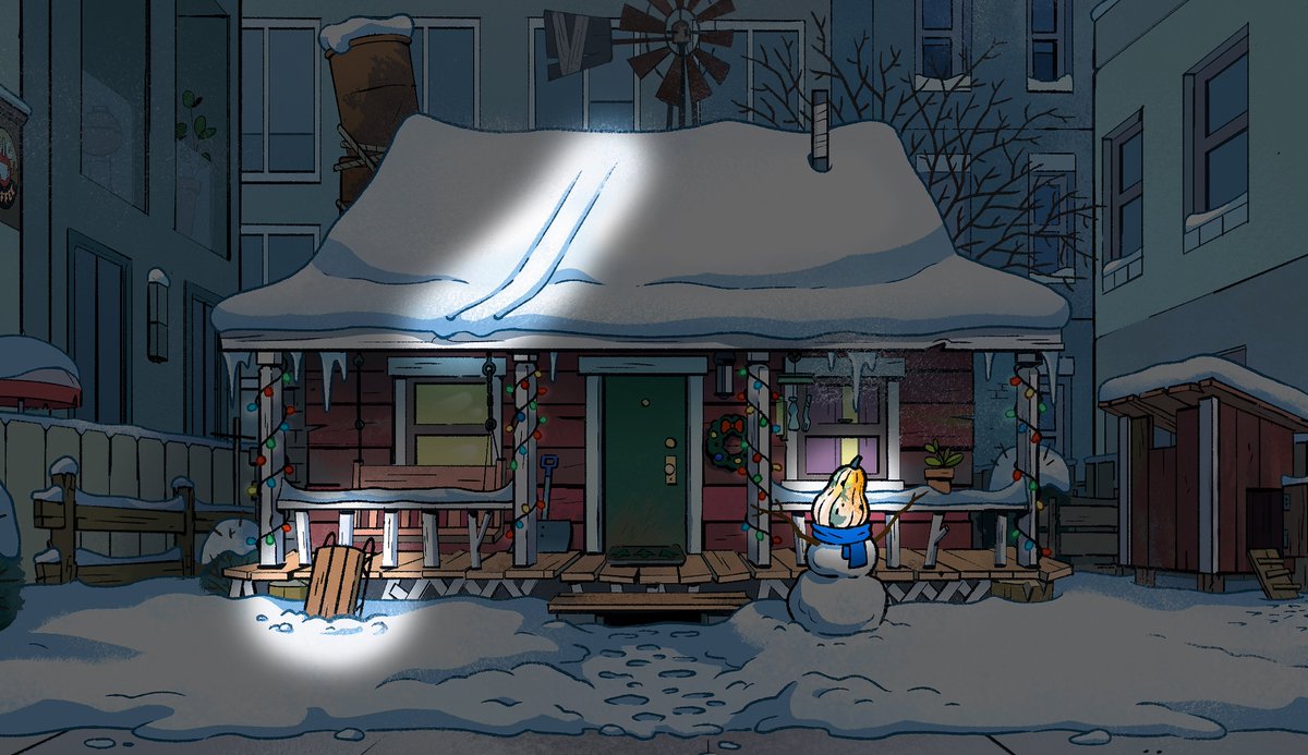
When you're designing a location for a scene, you have to think about what is about to happen in order to set the stage.
But also think about what characters have previously done there, even if it hasn't been seen. Then draw evidence of that activity.
But also think about what characters have previously done there, even if it hasn't been seen. Then draw evidence of that activity.
Bonus detail: That gourd-headed snowman was in the storyboard so it's not my concept, but it's an excellent character driven detail to include.
