,
9 tweets,
5 min read
Read on Twitter
1. I stopped by the Good Design exhibit at @MuseumModernArt and was reminded how strange it is to put everyday objects up on a wall.
When you take something like a fork, which is meant to be held, and put in up like art, the way it looks is the primary way you evaluate it.
When you take something like a fork, which is meant to be held, and put in up like art, the way it looks is the primary way you evaluate it.
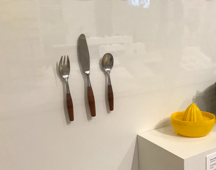
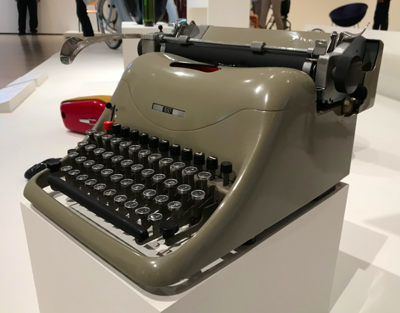
2. It's a good exhibit, but passively the effect of evaluating lounge chairs, typewriters and fishing rods without ever feeling them in your hand or experiencing them for their designed purpose, shallows what design is, and how visitors think about design.
3. In other words, there's nothing ugly here since aesthetics is the primary way visitors can evaluate what they see. But some great designs aren't necessarily all that stunning to look at. They will never be shown here.

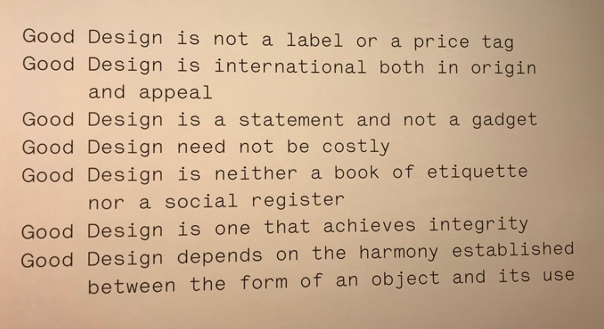
4. So you'll see stunning designs like this Spacelander Bicycle from 1946 - the problem is it was too expensive to produce widely and broke easily (a kind of design failure, yes?) so it was never really used by many. Yet here it is.

5. This is a meta-design problem of museums and design education. They have constraints too (e.g. preserving these artifacts restricting visitors from holding them) - but the medium of a museum, or the web, will always tend to overemphasize how designs look, over how they work.
6. That said, this was my fav item in the whole exhibit, in part because of how clear it was how it worked. I could imagine the spring-loaded resistance of turning that timer, and the sound it would make when it went off. But I had to imagine! (Kitchen clock, by Max Bill, 1956)

7. To MOMA's credit, they did have a small hands-on area in the back. But some of their choices were... visual-centric. They had a book which... is fun to look at, but I have no idea what it means for understanding design.
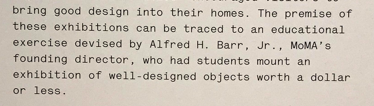
8. The exhibit I'd love to see is "Useful Household Objects under $5" which MOMA did in 1938 (inspired by a student project). I love adding criteria (useful) to help visitors evaluate what good means (although of course the objects still end up on a wall)
moma.org/calendar/exhib…
moma.org/calendar/exhib…
9. My last critique is this list - it's not written/designed well as definitions go. Why not simply say "good design solves problems", instead of odd examples of what it isn't? Or share Dieter Rams 10 principles? A lost opportunity here. (END) #valueofgooddesign #ux #design